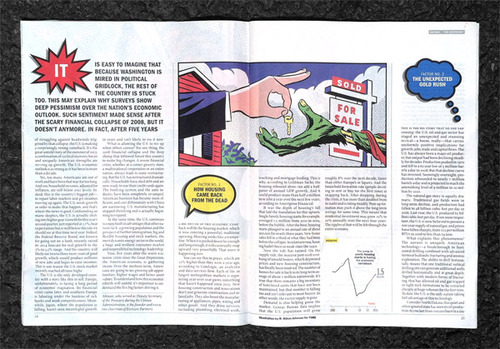
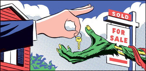
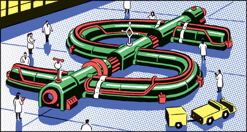
Time Magazine: The Economy Goes Pop!
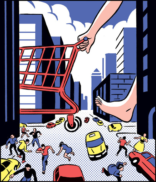
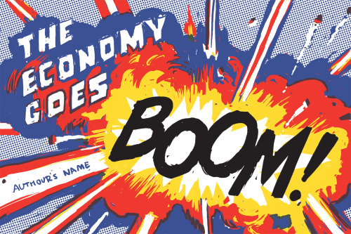
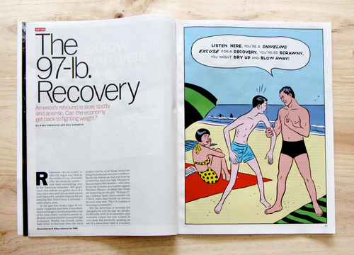
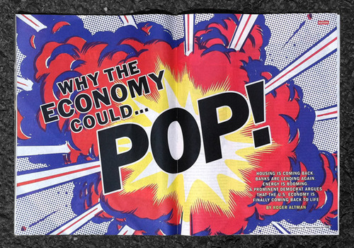 ↑ Art director April Bell commissioned this Roy Lichtenstein-inspired feature for Time magazine.
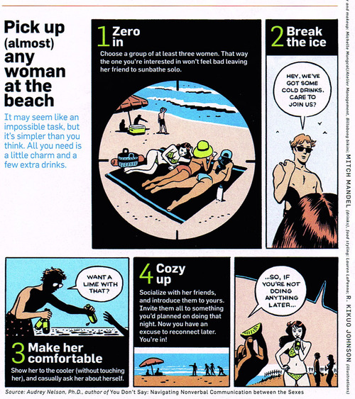
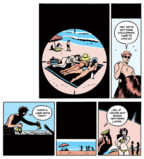
"The Birth of the Filet-O-Fish" and Other Magazine Comics...
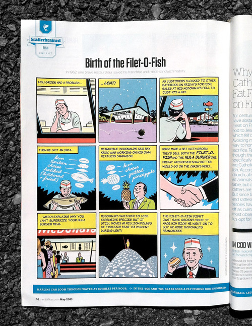 ↑ "The Birth of the Filet-O-Fish." Script: Mental Floss Magazine. Lent, 2013.
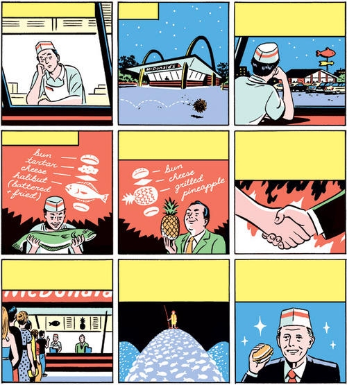 ↑ Unused red version. Art direction: Winslow Taft.
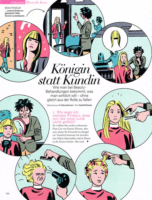 ↑ a 2011 feature in Myself Magazine. Art Direction: Caroline Caesar.
Some Prefer Nettles
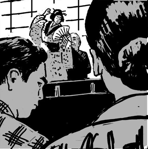
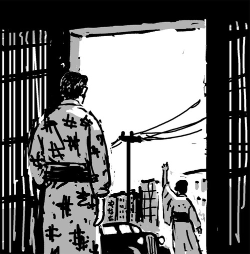
I had the honor of creating the cover art for a new English edition of Junichiro Tanizaki's 1929 classic, Some Prefer Nettles.
 ↑ This edition is part of Random House's new Modern Japanese Classics series. The entire line shares the same title treatment designed by John Gall.
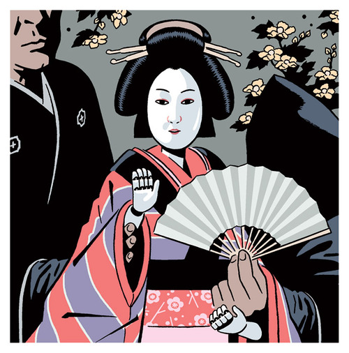 ↑ Bunraku, Japanese puppet theater, is central to the novel's theme.
Art direction: John Gall
A Million First Dates
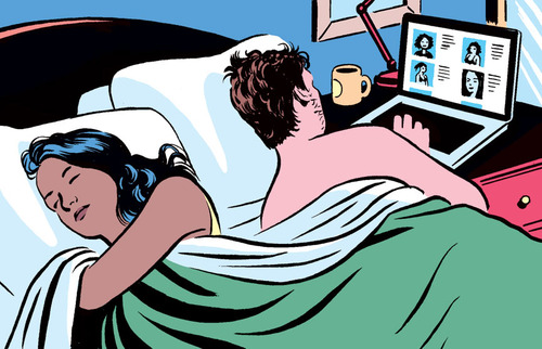
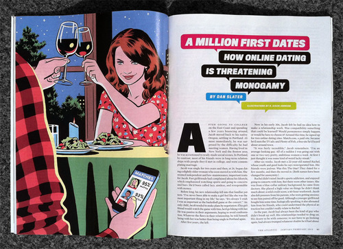 ↑ Atlantic Monthly feature on online dating.
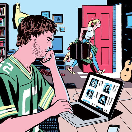 ↑ Finished spot illustrations. ↓
![]() ↑ Unused digital sketch of a fly fishing date described in the article.
↑ Unused digital sketch of a fly fishing date described in the article.
Art Direction: Darhil Crooks
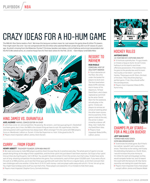
The Sport of Politics
Feature illustrations for ESPN Magazine...
↑ Our newly reelected left-handed president.
 ↑ I'll probably never draw this guy again. ESPN Magazine.
Art Direction: Jason Lancaster
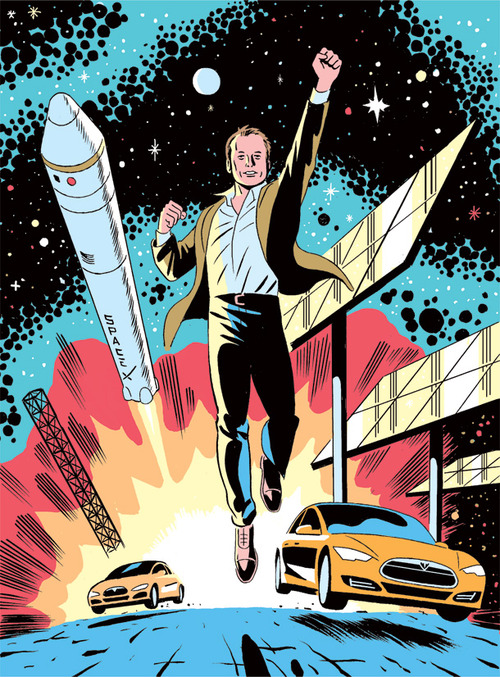
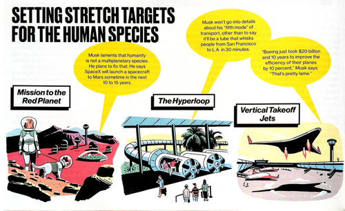
Elon Musk, Man Of Tomorrow!
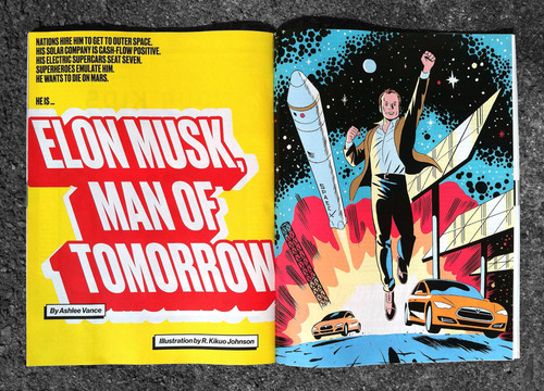 Feature Illustration for Bloomberg Businessweek.
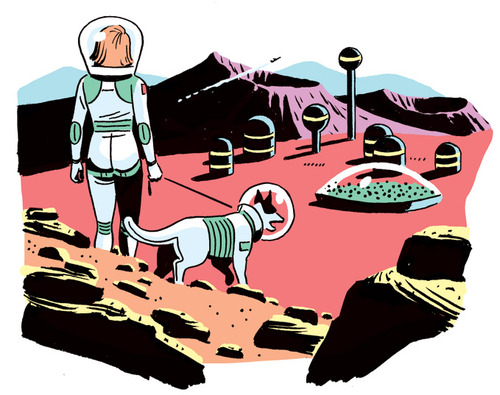 The article included 3 small spots imagining some of Musk's future innovations. I was thinking a lot about Wally Wood as I worked on these.
 An early sketch.
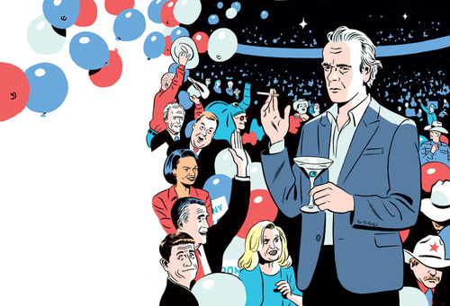
Martin Amis at the Republican National Convention
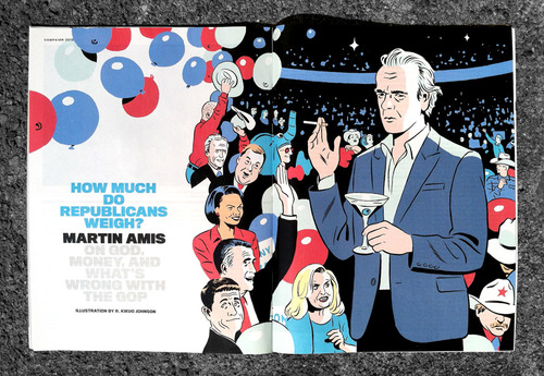 A feature by British novelist Martin Amis for Newsweek. I had less than a 48-hour deadline for this one: a day for sketches and a day for the final.
"The Proxy Marriage"
I recently had the pleasure of working on an illustration to accompany a lovely short fiction by Maile Meloy in the New Yorker.
 The editor, Chris Curry, sent me the layout above and suggested a dyptic with two separate scenes.

 I typically sketch until I have two or three decent concepts or until the sun is rising and I can't keep my eyes open. The three sketches above begun as very loose pencil sketches which I scanned and further developed in photoshop with a wacom tablet. After submitting these concepts, Chris suggested trying an eight-panel composition...
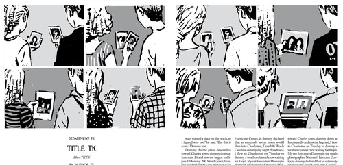 Sketch approved! One minor tweak to the first panel...
 I usually do a quick digital color study before I jump into the final.
 At this point, I turn the black lines of my color sketch faint yellow and print out the sketch on a tabloid sized piece of bristol board. The yellow ink, barley visible in the photo above, serves as my "pencils." I still use traditional media for inking: real brushes, nibs, and India ink. As you can see above, a fair amount of editing takes place during this stage as well.
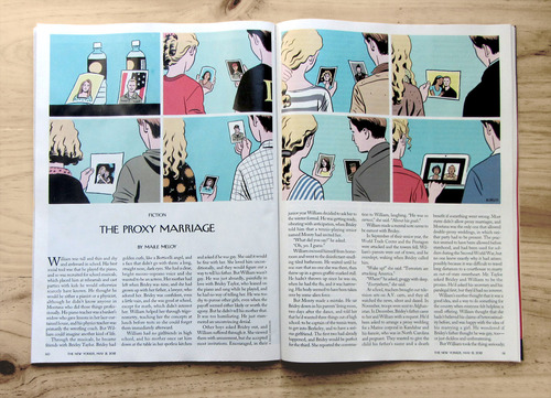 Next, the color gets added back in digitally, and, presto.
Print Magazine
Illustration for a Print article about graphic designers who self-publish. Special thanks to Stephen Savage whose incisive metaphorical illustrations inspired this one (I draw the comparison at my own peril!).
Time Magazine
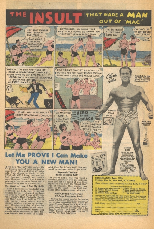
Feature illustration based on the classic "Charles Atlas" comic book ad.
Art Direction: Chrissy Dunleavy

